A home in India should feel like it belongs in India — and to the person living inside it.
This is where the studio begins.
There is a particular home that has quietly become the global default. Soft white walls,
a slab of marble, a fiddle-leaf fig in the corner, brushed-gold tapware, a low linen sofa,
and a careful absence of anything that might date it.
You could photograph it in Mumbai, Dubai, or Los Angeles and struggle to tell which city
you were standing in. It is calm and competent. It is also anonymous.
We built Vogelkop on a different belief: a home in India should feel like it belongs in India,
and more precisely, to the family that lives inside it.
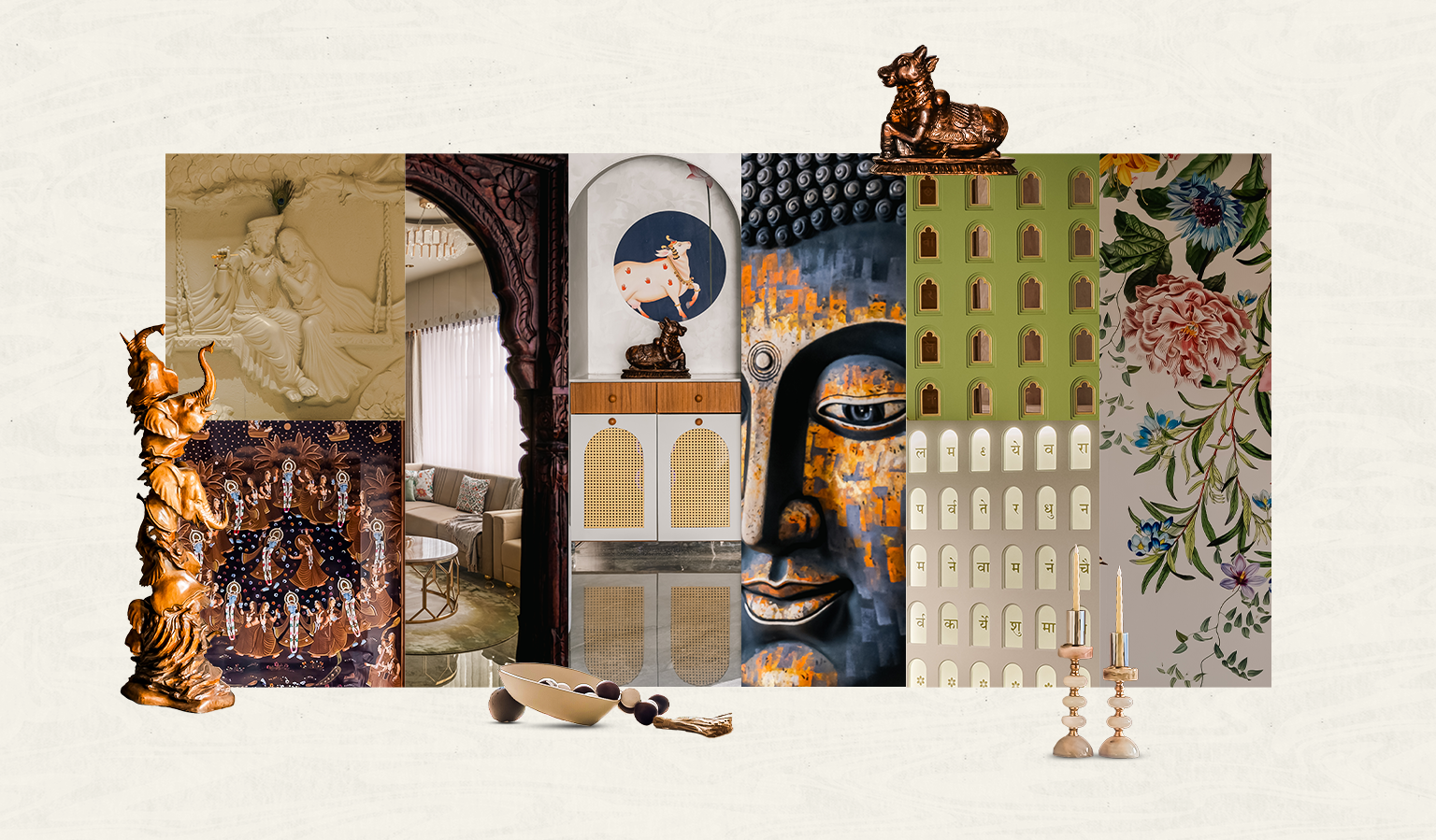
“Indian” is not a style. It is a sensibility.
When people hear “Indian interiors,” they usually picture one of two extremes.
Either heavy carved furniture, jewel tones, and temple motifs on every surface,
or a complete rejection of all of it in favour of the international minimal look.
We are interested in neither.
An Indian interior design philosophy worth defending does not live in ornamentation.
It lives in how a space is organised around the way Indian families actually live —
the weight given to the threshold, the presence of the sacred inside everyday rooms,
the behaviour of light across the day, the instinct for hosting, and the comfort
of materials that age rather than expire.
These are sensibilities, not decorations. You cannot order them off a mood board.
A home can feel deeply Indian with white walls and clean lines if the bones of it
understand where it stands. And a home can be covered in jharokhas and brass and still
feel like a film set because the understanding underneath is missing.
What We Keep, and What We Leave Behind
We are selective. We keep the things that carry meaning and let go of the things
that only carry decoration.
- We keep the threshold as an event.
- We keep the sacred woven into daily life.
- We keep handcraft and human-made imperfections.
- We keep proportion, symmetry, and rhythm.
What we leave behind is the pastiche: carving applied everywhere until it says nothing,
colour used only to signal “ethnic,” and literal reproductions of historical architecture
without understanding the principles behind them.
Restraint is what allows meaningful elements to be felt. One restored jharokha,
framed by a calm wall, will always say more than a hundred new ones.
How This Looks in Practice
Keshav
In Keshav, a residence in New Alkapuri rooted in Rajputana lineage and the spirit
of Vrindavan, the Indian sensibility is everywhere and almost nowhere obvious.
Three handcrafted jharokhas, each over a century old, were restored and integrated
into a clean contemporary partition. Brass runs through the home as a single
connective language across hardware, profiles, and fixtures rather than as scattered ornament.
A Sanskrit shloka hides inside sixty miniature niches and reveals itself only when
the light is switched on. None of it shouts. All of it belongs.
Sukoon
In Sukoon, a retirement home in Chandkheda, the same conviction speaks more softly.
The palette grew naturally from the apartment’s existing cream flooring.
Indian warmth arrives through handcrafted artwork, a national-award-winning
Ashtavinayaka piece, a palace-inspired upholstered headboard, and gentle curved forms —
never through traditional motifs applied excessively.
It is unmistakably an Indian home designed for an Indian phase of life without a
single predictable signal of “tradition.”
Radha Madhav
In Radha Madhav, a penthouse where Japanese restraint meets Indian artistic spirituality,
the central mural of Radha and Madhav was hand-sculpted in clay before being cast.
A teakwood swing on the balcony aligns precisely with the swing occupied by the deities
inside the mural, creating a dialogue between the residents and the divine.
That is what we mean by rootedness. It is not a motif on a wall.
It is a relationship between people, space, and meaning.
Vastu as Design Logic, Not Decoration
We treat Vastu as spatial logic rather than superstition. Directional planning,
the placement of the sacred, the movement of light and air, and the orientation
of rest against activity are observations about how people feel inside a space.
In Keshav, a brass sunrise motif sits over the eastern passage while birds in flight
face west, turning a Vastu principle into a piece of spatial poetry.
We never use it to alarm a client or sell a quick fix. We use it because,
handled honestly, it deepens the design.
Designed for a Place, Not a Postcard
Where a home is built should shape how it feels.
The light in Gujarat, the way families gather, the craftspeople within reach,
and the materials that belong to the region are all forms of design information.
Designing from Vadodara for clients across Vadodara, Ahmedabad, Gandhinagar,
and beyond, we see context as a starting point rather than a constraint.
A Home That Remembers Where It Is
A house assembled entirely from global references can be impressive,
but it rarely remembers where it is.
It does not carry the client’s story, the family’s rhythms,
or the city outside the window.
We would rather design homes that know exactly where they stand —
homes that are unmistakably contemporary, unmistakably refined,
and unmistakably Indian.
Not through ornament, but through atmosphere, material, light, and intention.
That is the studio’s position, and it is the foundation everything else we do is built upon.